
Website Design
Website Design For Townsquare Interactive
Client: Cafe Italia Ristorante
Team: Self directed, with feedback from stakeholders and peers
Role: Web Designer (UX/UI & Front-End Dev)
Tools: Photoshop, Illustrator, Figma, CMS, HTML, CSS
JUMP TO THE BELOW SECTIONS OF MY WORK:


CLIENT BRIEF
THE CHALLENGE
To create a new website that is easy to navigate to view the menus available from the restaurant.
GOALS & STRATEGY
Responsive website
It is important to have a responsive website for restaurants because 77% of diners check the restaurants website before visiting. The driving factors to visit the restaurant is the items on the menu, but if the food photography is not high quality it could turn customers away. A few other key factors of the responsive website is the navigation and readability, if it’s difficult this also will be a turn off for customers.
Visual design matches restaurant’s current branding and food offered - client requirements
The restaurant storefront wanted to have the same branding and showcase their real food. The strategy for this was to incorporate real photos of the inside and outside of the restaurant as well as actual photos of the food. The first impression of the website should be consistent with what they will see when they get there. It’s important to attract the target audience and create proper expectations.
Encourage users to book reservations
The strategy to reach this goal was to have the contact information available on every page of the site. I also implemented call to actions throughout the site by adding call to action text, buttons, and contact us forms.
RESEARCH
MARKET RESEARCH
After collecting information about the restaurant industry I found key takeaways to apply into the website:
Key takeaways:
Responsive design is a must since most views are from mobile devices
If it’s challenging to navigate an online ordering portal customers will abandon carts
Avoid PDF menu’s it is more difficult for mobile users to use and the search engines to read
Provide a website theme that matches the restaurant’s style, first impressions are key and customers expectations must be set properly
Provide links to your social media profiles and Google My Business review’s this is great for cross promoting and possible customers always look for reviews about the restaurant and the food
TARGET AUDIENCE
The target audience is geared towards diners that are craving authentic Italian food that is informal and family-friendly.
COMPETITOR ANALYSIS
I completed a competitor analysis of other businesses in the local area of New Bedford, MA, by comparing the websites, product offerings, and branding.
Pa Raffa’s Italian Restaurant
Strengths: Strong local ties, good reviews on GMB
Weaknesses: no menu available, only 1-page website with little information, no images of the actual food, color contrast issues, lack of branding
Ma Raffa’s Italian Restaurant
Strengths: Strong local ties, good reviews on GMB and Yelp, affordable pricing, large menu offering, google maps integration, branding is authentic
Weaknesses: PDF’s as menus, broken image to the dinner menu, some parts have poor contrast, no back story or connection
Riccardi's Italian Restaurant
Strengths: Strong local ties, good reviews on GMB, affordable pricing, large menu, party platters available, branding is consistent
Weaknesses: Website functionality issues, outdated website, pop up video on autoplay is spammy


DEFINE
PERSONA
Bringing together all my research, I created a fictional user persona. This helped me empathize with the users and focus on their motivations, needs, goals, and frustrations.
POV STATEMENT & HOW MIGHT WE QUESTIONS
Now with a better understanding of the target audience I defined and strategized how I could solve potential problems. The POV statements and HMW questions help me to formulate problems and frame it in a way to invoke strategies to solve them.
IDEATE
BRAINSTORM
Referencing the HMW questions I brainstormed features and ideas for each question. I did 2 rounds of brainstorming for each question for 3-5 minutes per round to allow ideas to flow without overthinking.
PRODUCT ROADMAP
Also using the HWM questions I prioritized the top 3 questions with added features and metrics that I identified through my brainstorming sessions.
SITEMAP
Using the product roadmap I started working on the information architecture by creating a sitemap. I used the sitemap to determine the structure and navigation of the website.
dESIGN
SKETCHES
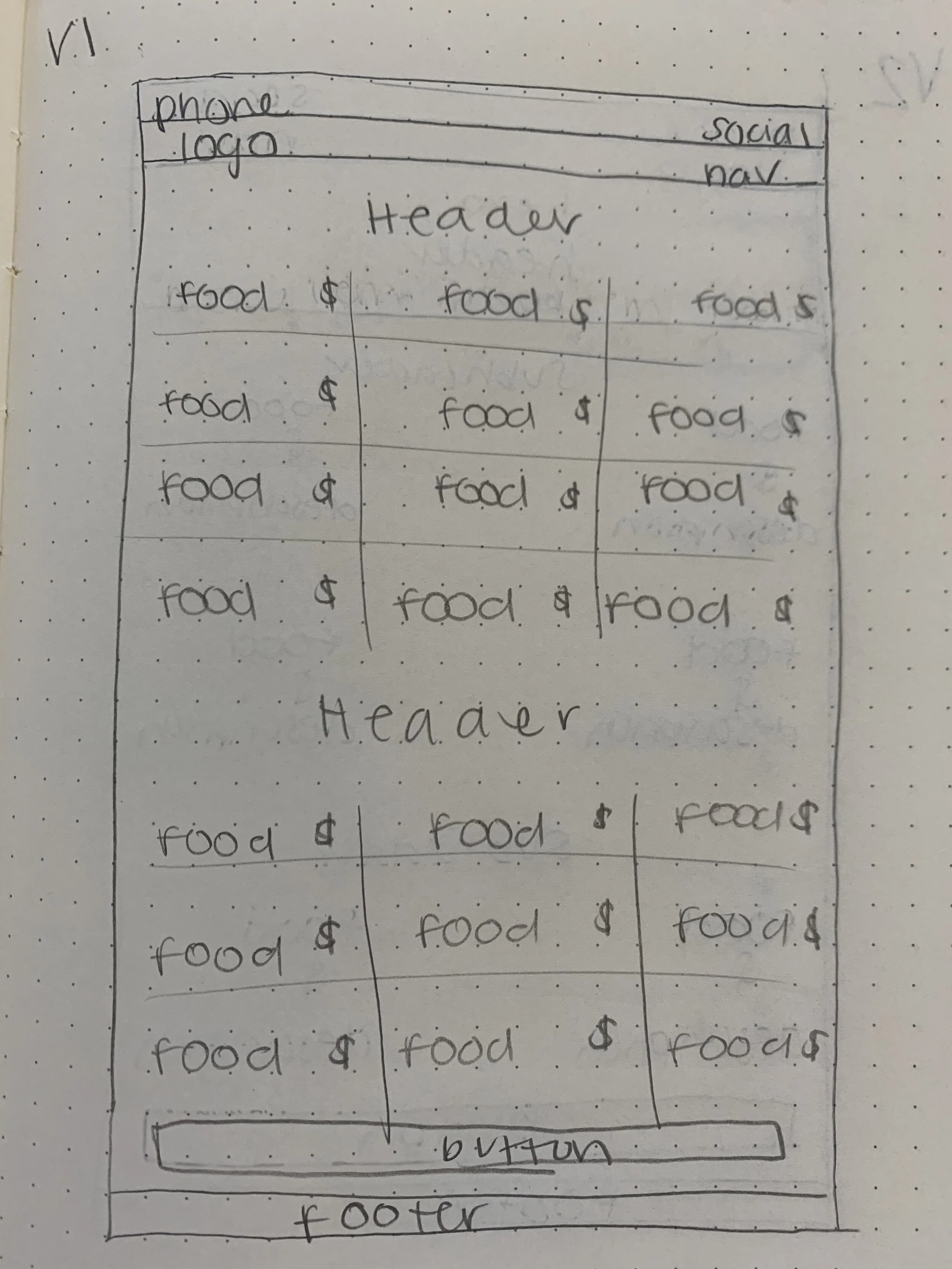
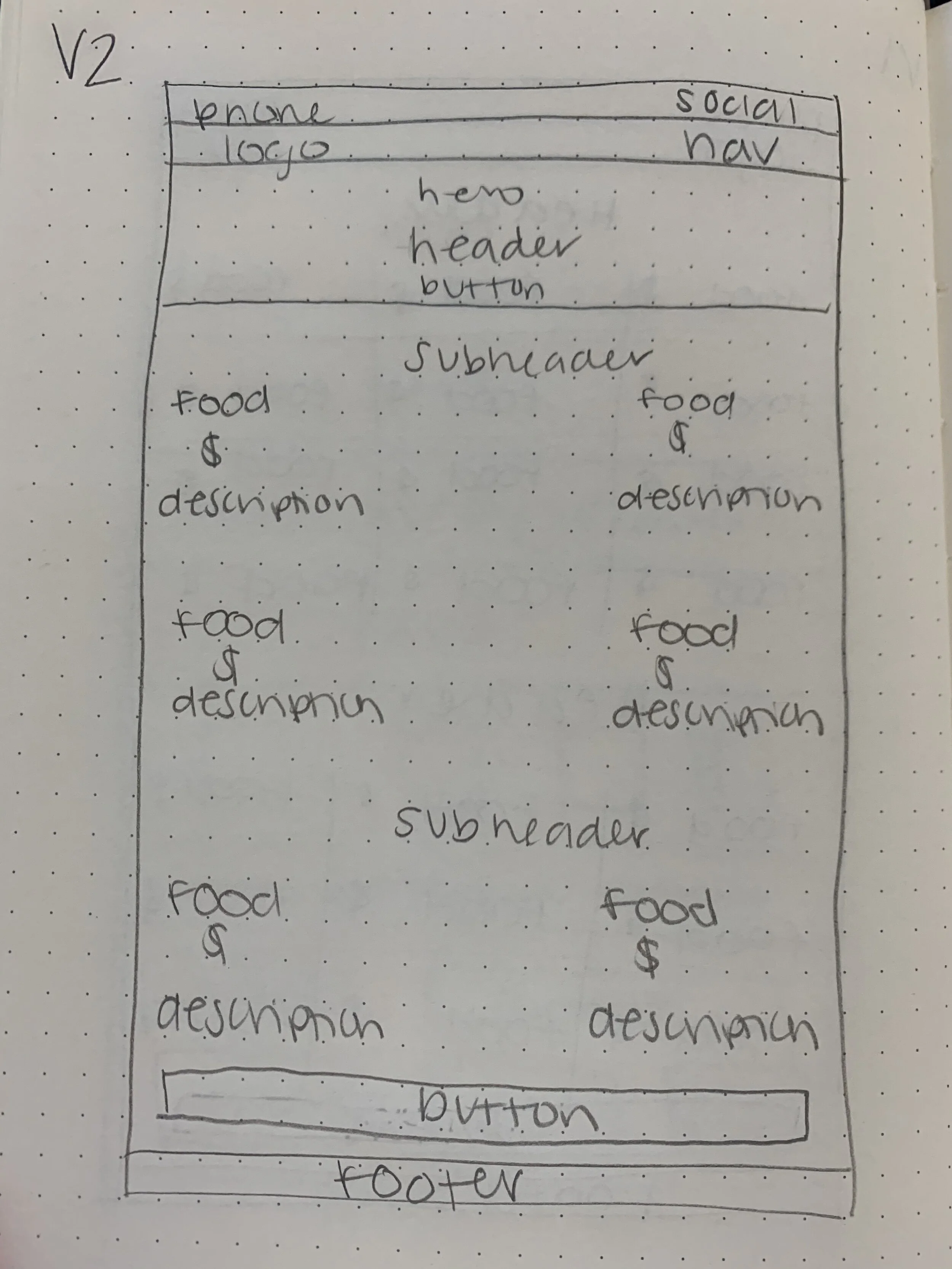
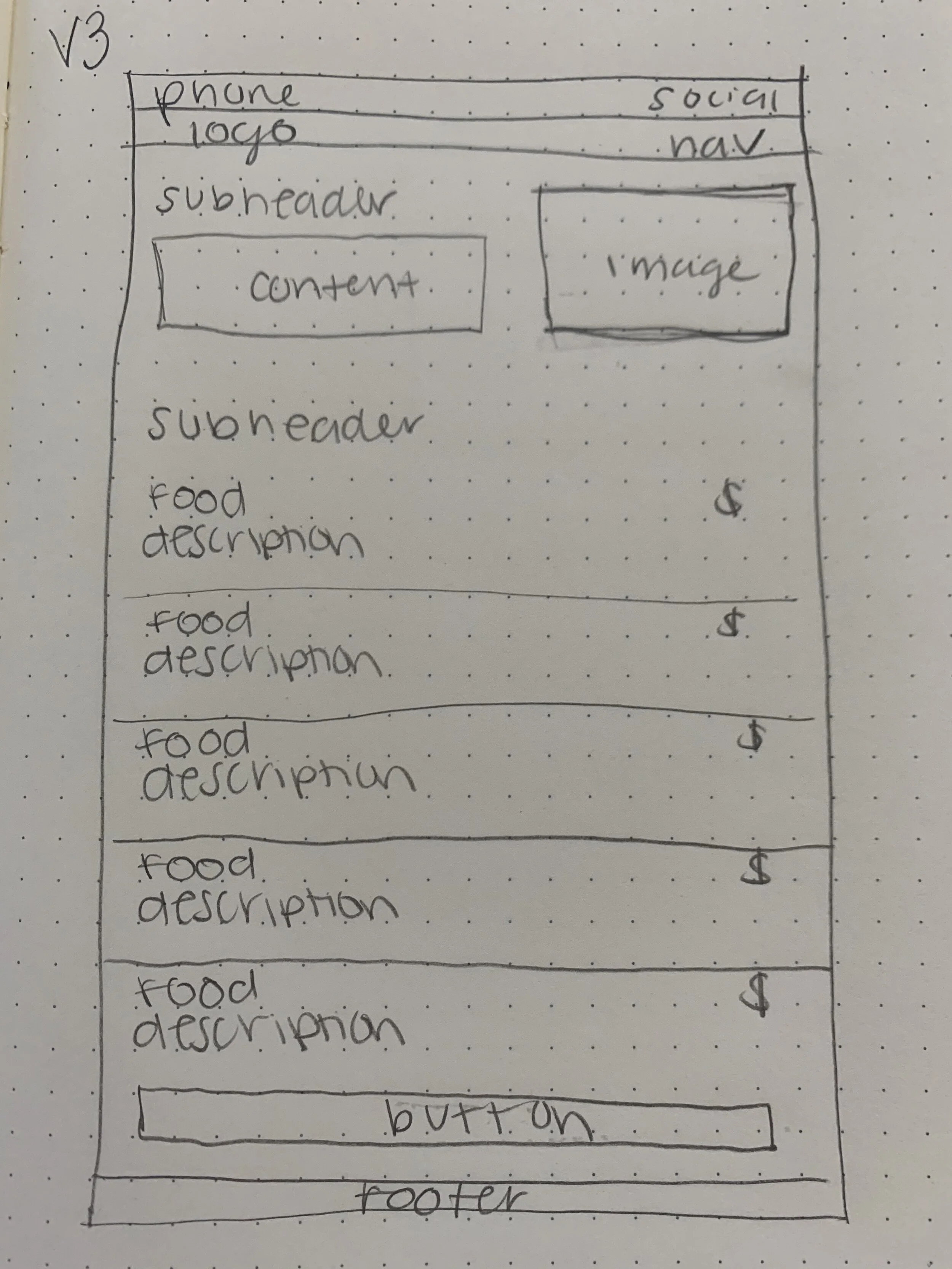
Next I quickly sketched wireframes to come up with a few options of the overall layout of the interface.
After sketching I had a design review with my peers to establish the best design for website for the restaurant and the user. We covered the following key points:
able to view menus on desktop, tablet and mobile
responsive menu on each sub-navigation page
typed out menu so that it easier to read for the user and better for SEO
descriptions of each food item along with the price
encourage users to book a reservation
CTA text to make reservations for 5 more people for lunch or dinner
required to make reservations for Saturday’s and Sunday’s
CTA floating button linking to contact page
HOME PAGE:
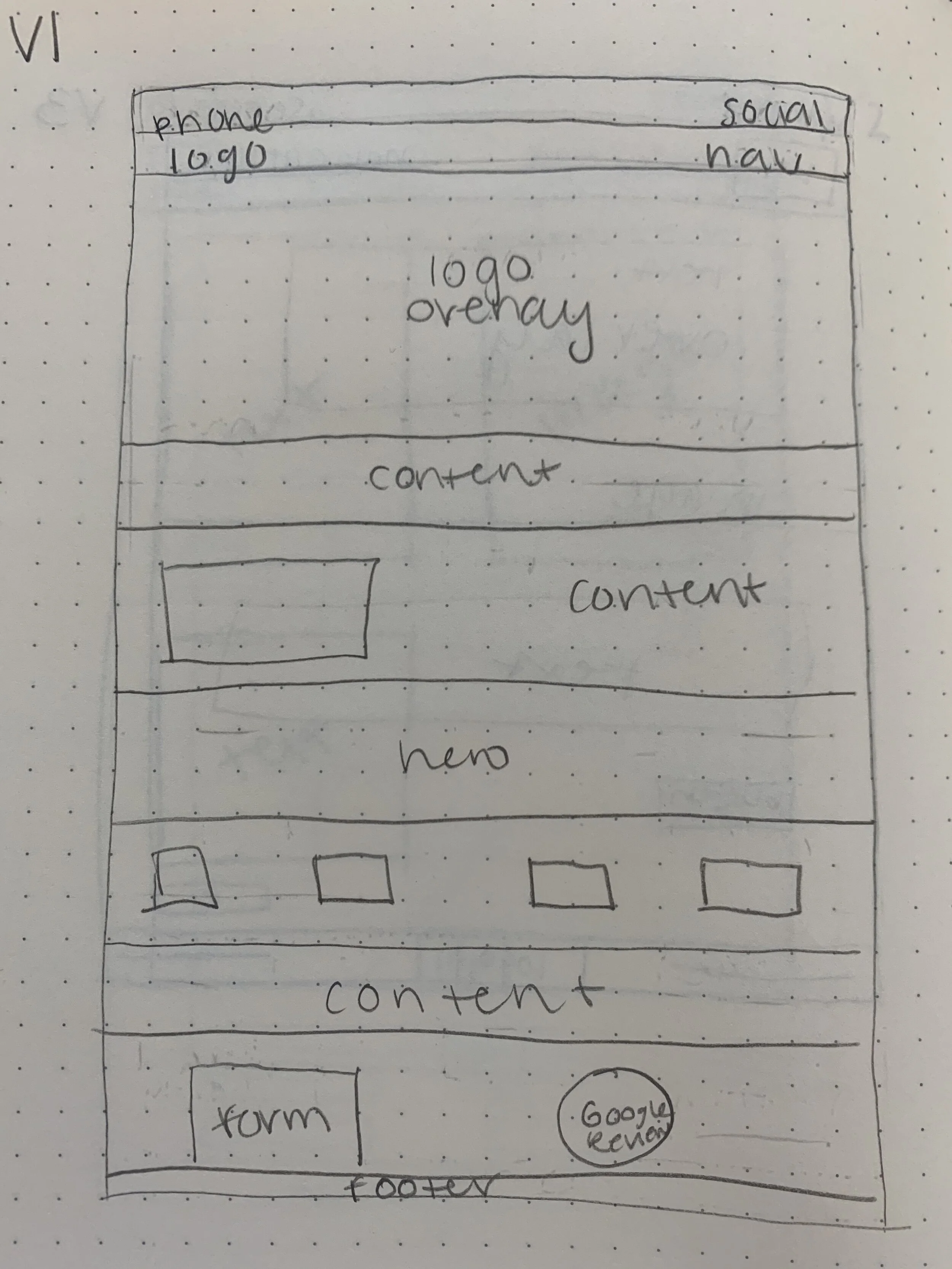
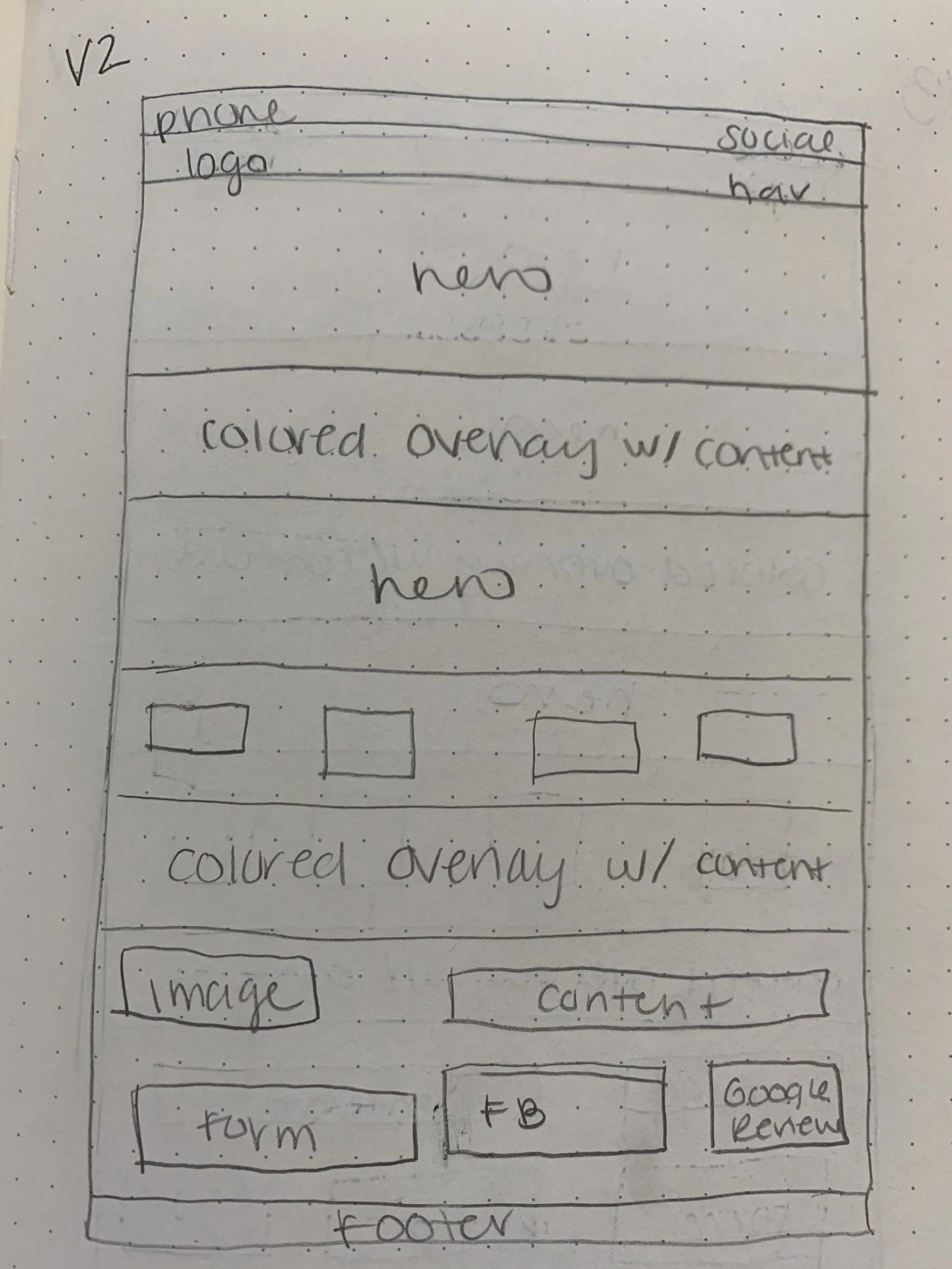
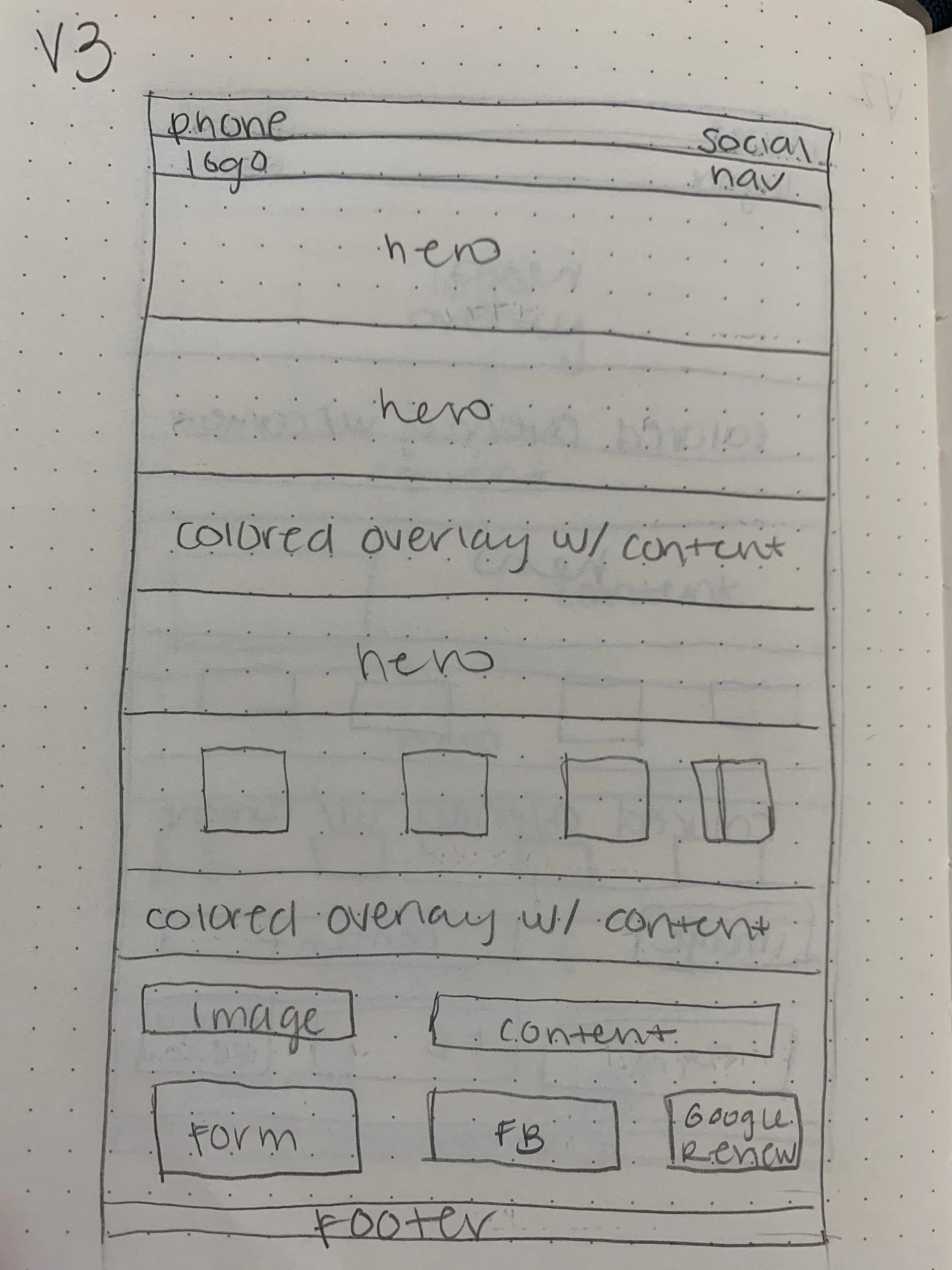
INTERNAL MENU PAGES:
WIREFRAMES
After deciding on the final layout of my sketches, I created mid-fidelity wireframes. These wireframes addressed the goals and needs of the user and became the foundation of the final website design. These were only used as a reference during my build process.
STYLE GUIDE
The restaurant already had a logo so I was able to build a cohesive style guide while using the logo as the starting point.
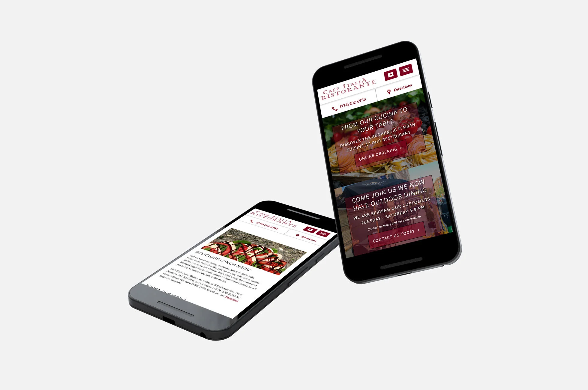
BUILD
With my mid-fidelity wireframes as a guide I built out the responsive website using my former employer’s unique Content Management System and manipulated the HTML and CSS to build the live site. Please note that clients have complete control over edits and that the original design may now be altered. Below are some pages from the site.


REFINE
After sending the test URL to the client they requested a few modifications. One request was to use mostly pictures they had taken of the food and restaurant throughout the site. I was able to resize a few and use about 90% of their own photos. Unfortunately some photos were not high resolution or big enough to use as the hero’s. They also requested the colored overlay over the 3rd and 5th hero on the home page to be darker in order to more easily read the text. After these adjustments were made the website went live.
REFLECTION
For this site I realized that people love to have options or choices because they like to feel that they have control. When people feel like they are in control they feel their actions are powerful. This is important for dining experiences because first the customer has to choose your restaurant and then they have to choose what they want to eat and / or drink while there. Cafe Italia Ristorante provides many options for customer via their menu, increasing their chances of being chosen by future customers.